


One of the most important parts of running a business is controlling your finances. If your sales and spending aren’t in control you most likely don’t have a consistent process for going about your day to day business. If your business is not consistent it will be very difficult to make incremental changes that stick and grow your business. You also run a higher risk of having a few bad months that put you under.
Control Charting comes to us from the world of Six Sigma which measures production process control. A Control Chart is a graph to study how a process or system changes over time. Control Charting is a good way to measure if the changes you make to your business are making a statistically significant difference in your numbers.
The 5 Sentence Splash: Quick Summary of the Tool
Control Charts show the expected high and low value of each income or expense account in your finances based on history. R-Charts show the same for the rate of change from month to month and focus on having unexpected magnitudes of change. Standard Deviation, from the world of statistics, allows us to predict what the expected values should be 99.7% (red) and 95% (yellow) of the time. If you see items outside of this norm you should understand if you have a legitimate reason for the inconsistency or if you have systemic problems. These charts also have the ability to diagnose statistically significant changes in process that were hopefully driven by you as the owner, such as supplier negotiation or successful marketing campaigns.
Why Does this Matter?
Your business should have some level of normalcy and consistency from month to month or from season to season in the case of seasonal businesses. If your results aren’t somewhat consistent and you can’t explain why, chances are your business is running you instead of you running your business. I have also seen that a “hand to mouth” behavior gives us completely inconsistent results on these charts. Those kinds of charts indicate reactionary behavior instead of proactive planning in a business. Granted, some unfortunate events really aren’t controllable, but those types of events shouldn’t be the norm of a growing successful business. If you find yourself having lots of issues as a result of this analysis, there are some tools I’ll link to which should help you make improvements in this area.
These charts indicate a failure of consistency in some way.
Good Inconsistencies: (things you should be able to expect and explain)
- Cost reduction initiatives
- Sales and marketing initiatives
- Process changes to improve operation which create a “new norm”
- Massive growth such as a new contract
- Identification of supplier cost increases
Neutral Inconsistencies:
- Truly one of a time unexpected events such as natural disasters
- Seasonal events (when not charted year over year)
- Evidence of consciously cancelled products
Bad Inconsistencies: (Where this tool helps diagnose potential issues)
- Accounting Related Failures:
- Inappropriate expense account classification
- Inconsistent timeliness of paying bills
- Wrong date entry of expenses
- Operations and Cost Control Related Failures:
- Lack of control and process for inventory stocking
- “Hand to Mouth” behavior, having a backlog of expenses that only get paid when you have a lucky break on income or spending until you’re out of money without a plan
- Lack of allocation and accrual for known, expected, repeating expenses
- Innapropriate or whimsical purchases (By employees, partners or owners etc)
- Marketing and Sales Related Failures:
- Lack of sales funneling process
- Reactionary marketing vs proactive marketing
- Lack of planning for repeatable seasonality
How To:
Load up the Template:
I am providing a template for this because the most value comes from looking at the charts. You can make these yourself or use other software that is readily available to make these types of charts if you’d like. The template below has some randomly generated data in it with a few specific scenarios from above that we’ll be diagnosing in this post.
Control Chart Template Download
You can follow along with the random data in the template for now, but the real value comes from using your own data! Paste your Monthly P&L data in the “Profit and Loss” worksheet and make sure the calculated date cells in row 4 match the actual months that the data is from (hint: DON’T overwrite row 4). Use the “Start Date” and “End Date” cells to help change and align the dates in row 4. The template is set up to automatically handle data from row 5 to row 150.
On the “Control Charts” sheet enter the same dates in the “Start Date” and “End Date” cells for now, the ability to change the dates on the Control Charts sheet will be useful later. Then select an account you’d like to analyze from the drop-down menu in cell C5 and Viola! You’re control charting!
What’s this Thing Doing?
The first type of Control Chart is a Means Chart. We plot the data as the blue line and then calculate the standard deviation and average of that data. Then we calculate plus or minus 2 and 3 standard deviations from the average. This now represents the expected value of the most recent month’s spend with 95% (±2σ) and 99.7% (±3σ) probability. We’ll label the average plus 3σ the Upper Control Limit (UCL) and the average minus 3σ the Lower Control Limit (LCL).
The second type of control chart is an R-chart. In this application, an R-Chart is the Range from one month to the next. Otherwise described as the magnitude of change or absolute value of the difference from month to month. We can apply the same statistics to watch our expected change from month to month with +2σ and +3σ. +3σ will again be the Upper Control Limit (UCL) for the R-chart. There is no Lower Control Limit because the magnitude of change should always be positive and the lowest value you can possibly have is zero.
Application: Diagnostics of the Sample Data
Ideal Operation:
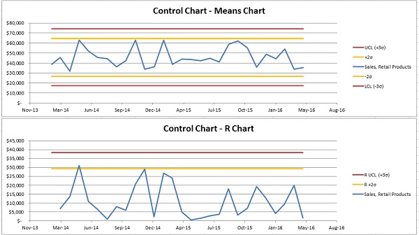
Ok, so if you look at the “Sales, Retail Products” account from the drop-down you will see a sample of what a fairly normal Control Chart set looks like:
There are some occasions where the data bumps up into the yellow area, but that’s OK. we should expect to see that about 5% of the time.
Increase in Sales:
If we look at the “Sales, Engineering” account you will see that something is out of whack:
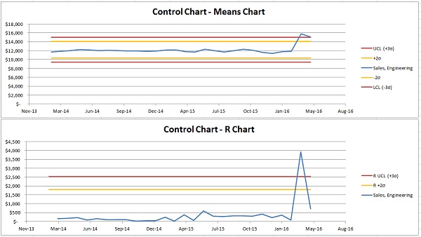
There was a significant spike in engineering sales. This means a few things. You probably know that your sales team just won a new customer account and that they’re starting to pay for engineering support on a 6-month project. This is showing that the new sale is a statistically significant event, which is great! Watch if this becomes a new norm. You should see the sales continue at the same rate for some time. When you’ve had at least 5 months of these increased sales, you should change the start date of your charts for this account to correspond with the beginning of this new period. Now, the watch out here is if you see this spike but then a trend back to where you were operating before. This may be indicative of other issues, such as resource constraints. You don’t want to have all your new work for naught because of other issues.
Increase in Administration Wages:
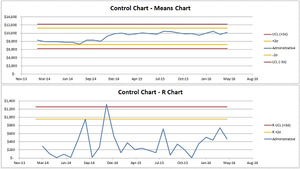
The “Administrative” expense account shows that you hired a new employee for the front office in December of 2014. You can see that looking at this account with the full range of dates in the file only shows that there was a significant increase in spending in the R-Chart. This is a good example of a “New Norm” that you should be aware of when Control Charting.
If you change the “Start Date” of the control chart you start to analyze the data based on your new norm. You should try to do this on a regular basis if you see large changes so that you can watch based on the best data.
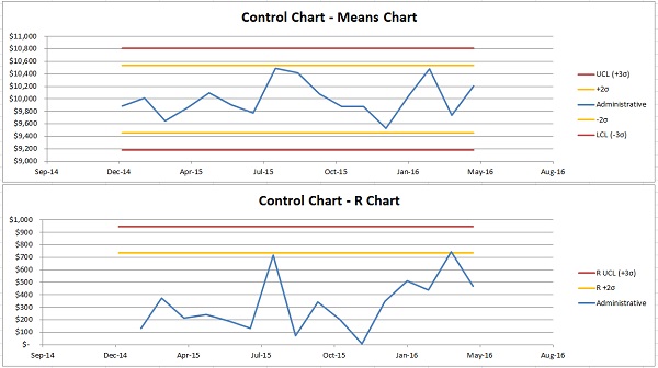
This chart shows the difference in UCL and LCL that changing the date to represent the new norm creates for you. One of the issues with dealing with change is that you need to have at least 6 months of data for the UCL and LCL to be calculated correctly. This is, unfortunately, a limitation of the math involved.
Accounting Errors:
The final example of error catching in our funny data is “Total Office Supplies & Rent”.
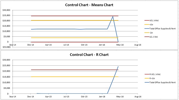
This is an example of the accounting department incorrectly dating a rent bill. We’ll say there was confusion between accrual and cash based accounting by the office admin who is starting to learn accounting in order to grow his/her skill set and help your CPA. This shows that there are two payments listed in March and none in April. Luckily this is an easy fix. Unfortunately, I’ve seen this kind of thing happen way more often than I’d like.
Extensions:
Control Chart you KPIs
You can use control charts for all kinds of stuff besides financials. One additional metric could be volume of sales or average ticket size. Basically, the math works out for all of that. Just change the units in excel so that the template isn’t looking for dollars and it should work the same.
Limitations:
Control and Consistency are Usually a Function of Business Size
Control Charting is designed for measuring systems that aren’t supposed to change. Small business is oftentimes not as controlled as that. Small business income events are more sporadic and expenses can be more sporadic than Control Charting statistics are designed for. There is still value in understanding how these results may affect your P&L Forecasting, but the only real way to find out if there is real value in the analysis alone without the intention of forecasting is to try it. As a ballpark, if your business has more than half a million in annual sales and operation there’s a good chance this can help on some income and expense accounts. If you’re operating at less than that then you’ll have to use discretion to guess if this can help solve some of your issues.
Inconsistent Expenses
Expenses that are annual or seasonal won’t work for this type of chart unless you only compare the same respective month each year. For this to work you’d need at least 6 years of data for the chart to work.
You will also notice an issue if your expenses and sales aren’t fairly constant from month to month. The standard deviation is just a prediction of the range that your data would be expected to land if.
Fudging it a bit for This Application
We’re not using true Six Sigma based methods for control charting. We’re getting as close as we can with the types of data that most businesses have in their finance software for producing Profit and Loss and Balance Sheet statements. For a tutorial on the math and methods of true production based Control Charting feel free to view this article or search for more articles online.
We’re also purposely using the standard deviation of the population. It’s debatable if we should be assuming our data is a sample of the population instead, but we’re using the more conservative approach in this case. I would argue that according to GAAP, finance data should represent the full population of financial data for the period we’re analyzing. If you’re not a Statistics Nerd, and you’re wondering why I’m saying that deviants are standard, you can comfortably ignore this entire paragraph.