
All models are wrong, some are useful. Forecasting is a method of developing a model that tries to predict future performance of your business. In this case, they will be based on historical trends. These models can then be used to make decisions about which plans and scenarios seem to have the most favorable future outcome and to help justify your plans to investors or bankers.
A full Forecast will include trend models based on historical data, predictions from planned changes and some level of sensitivity analysis. This blog will focus on developing trend models of historical data that we can use to project into the future.
We will attempt to find mathematical patterns in your Profit and Loss (P&L) data which show that your income and expenses are growing or shrinking with time. We’ll include additional options which account for seasonality as well as the variable nature of expenses relative to total income. You’ll need to help choose the “best-fit” between a suggested model and your data. The best-fit model is then used to predict what may happen in the future.
Keep in mind that garbage in means garbage out. Models can only try to understand the data which is given to them. Which means your financial data must be accurate without unreasonable errors or large changes in reporting practices. The data used to make these models must be representative of the business you’re using them to project for. Models aren’t given any data about outside forces such as economic conditions or competitive marketplaces, so they won’t account for those.
Let’s Do It
Download one of the more complicated spreadsheets I’ve created:
Update: This download has been removed. Find these kinds of solutions at www.BetterForecasting.com.
Load in your P&L data. When you’re using the Model Sheet, start with the Profit and Loss tab, ensure that all of the account names are in Column B starting at row 7 and then paste in your monthly P&L history data starting from cell C7. Ideally, we’ll have at least 3 years of data up to the worksheet’s maximum of 5 years.
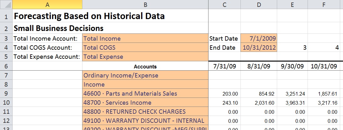
When the data is pasted in you need to help the sheet with a few items. Identify the Total Income account name, Total COGS account name and Total Expenses row in the drop-down menus. Also, please fill in the start date and end date of the data you pasted in and make sure the monthly time of the data lines up with the months shown.
The Approach
There are two ways to approach the problem. The simpler method is to just develop models for your Total Income, Total COGS, and Total Expenses accounts. If you do these three, select “View Totals Account Models Only” from the “What Resolution?” drop-down on the Forecast Projections worksheet. If this seems to be enough for you, then you may not need to do detailed modeling of individual accounts. However, if you feel that some accounts may not be accurate and need to be specifically modeled, then you should develop models for each account and select “View Account by Account Buildup” from the drop-down instead. As a final check, you should toggle between these two methods and make sure the differences in prediction can be explained.
Developing and Analyzing Account Models
The Models tab is where you get to do some thinking and tinkering. I have built in a bunch of statistics which go a long ways towards selecting the best model of your data, but the final litmus test and dealing with some strange situations that may arise in your data is beyond what can or should be done without human review and input.
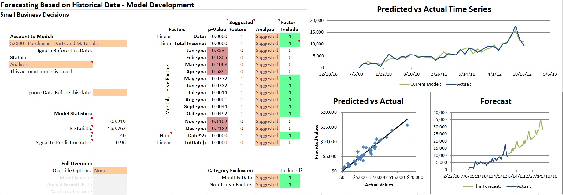
As you’re starting to make account models you’ll spend a lot of time staring at this:
Simple, right? Don’t worry, I’ll walk you through it.
Heavy Lifting Done Here: Automatic Model Suggestion
Start by selecting your first income account from the drop-down menu. When you do so, you should see that the worksheet automatically suggests what factors are important in modeling this account in the “Suggested Factors”. The term “Factor” is a modeling term for something that may be a good predictor of what is happening in the data you provided. Oftentimes your COGS and Expense accounts can be modeled based on your income (income is a factor), so finish your income modeling first.
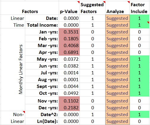
There are 16 Factors which I included in this workbook which seem to work for various cases of financial modeling. You can see that they’re in three categories: Linear Time, Monthly and Non-Linear. We try to determine whether they will be any good using a statistic called a “p-Value”. The p-Value determines whether the correlation between this factor and the data is statistically significant by testing for 0.10 or lower, which means that there’s less than 10% chance the Factor is not correlated with the data. A non-technical way to think of this is that it’s a “Peculiarity Score” which says that it’d be peculiar to include a Factor with a score higher than 0.10.
I Like Pictures
I had a manager point out to me that the human mind is incredible at picking out patterns in graphs. Let’s take advantage of that. I added three key charts on the right which you should be paying attention to as you’re working.
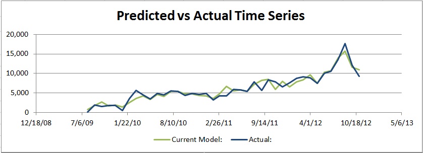
Predicted vs Actual Time Series
This chart is along the top of the page. This is meant to help you get a feel for how closely the model is following the actual financial data. This is where the model is trying to match the actual data as closely as possible A good model will the general trend of the overall data set and have peaks and valleys that line up with the ups and downs of the data. If you see that the model and the data are both kind of just bouncing all over the place, you probably want to try a few changes.
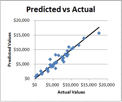
Predicted vs Actual
This plot shows each data point of the actual data on the bottom Axis with the model’s prediction of the exact point on the vertical axis. Ideally, all of the points would end up exactly on the black line. Pay attention to how this chart changes to understand if your changes are helping or hurting.
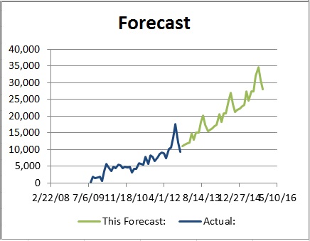
Forecast
This plot shows the actual data up to the date provided and the next 3 years of predicted values based on the model you saw in the Predicted vs Actual charts. You need to realize that the models don’t have any data in the future, and are trying to extrapolate into the future. This is where your brain needs to pay attention and make sure it’s not making some crazy prediction without a very good reason to do so. If you’re surprised at how fast it’s growing it’s probably not really going to be true. This will help you visualize the “Signal to Prediction Ratio” statistic on the left side when we get to that.
Thinking and Tinkering
Borderline Peculiarity
In an absolutely ideal case, we’d only use p-Values which are less than 0.05, but I don’t do that automatically because you as the expert need to try excluding those borderline Factors and see if the result makes sense. In the case that a p-Value is between 0.05 and 0.10 you will see this highlighted in yellow. That’s your cue to do some Thinking and Tinkering using the drop-down options in the “Analyze” column.
Strange Correlations
In some cases, you’ll run into an account which seems to have some correlation between some months but for no apparent reason. A great example of this is some Warranty data for a repair shop shown here:
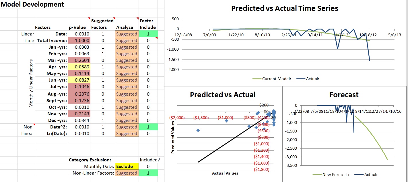
In this case, you’re better off selecting “Exclude” for Monthly Data from the Category Exclusion section so that the warranty expenses are evenly accrued over your forecast period. You could also make the argument that the trend in the bottom right Forecast chart seems to be growing too quickly. I’ll leave that up to you as you’re working out how you want to forecast your business.
Excessive Growth
One common issue with Non-Linear Factors is that they tend to over-predict growth by assuming that it will be compounding over time. If you see this happening in the Forecast chart and the “Signal to Prediction Ratio” gets fairly large you should exclude Non-Linear Factors to tame the beast.
Whippersnappers
On occasion, you may run into a case where you have an account which has not been in use as long as the rest of the business data. In this case, use the “Ignore data before this date:” drop-down to do just that: Ignore the irrelevant zeros before the selected date. Keep in mind that this will make your overall model strength lower as disused in the “Statistics to Consider” section.
Just Use Dynamite
When your data for an account just doesn’t make sense and you know what it should be, just use the “Full Override:” section to make the chart the way it should be.
Statistics to Consider
You’ll see on the left side that there are four statistics which I have included: r2, F-Statistic, n, and Signal to Prediction Ratio. These are attempting to measure the health of the model you’re currently analyzing. If you see something awry here, it means you need to think about whether the prediction makes sense and potentially make adjustments.
In many cases, your adjustments may make these high-level statistics seem worse. That is expected, so don’t worry too much about it as long as you have some solid logic for why you’re choosing to model things the way you are. I included some commentary on these in the comments embedded into excel. You should hover your mouse of the cells with the little red arrows in the corner to see what is said. (now I don’t have to use as many words in my blog about it!)
Save Your Work
I know, we’re moving to a world of auto-save and the idea of “saving” a file is antiquated with the advent of Solid State Drives and Cloud Computing. Maybe I’ll find a way to make this feature available, but that’s a lot of work! We all know the jokes about this, so maybe I really should do this at some point.
To save a file, toggle the “Status:” drop-down to say “Save” and then toggle it back. You have to change the model back off of save manually. Strange, I know. This was the only way to do it without using macro’s which get’s into a whole new realm of security clearances that I’d rather avoid.
In the case that you want to delete all the work and start overuse the drop down on the top right of the “SavedCoef” tab. Toggle it to “Clear” and then back to “None” to wipe out everything.
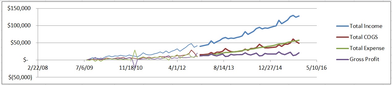
Look at the Big Picture
When you’re all done playing with the numbers, take a look at the big picture on the “Forecast Projections” sheet. This will show you what all of these models you’re building are leading up to. In the chart, the thin lines are historical data and the thick lines are your new model. Please spend some time criticizing your own work to ensure that you actually believe the models. Remember, “All Models are Wrong, Some are Useful.”